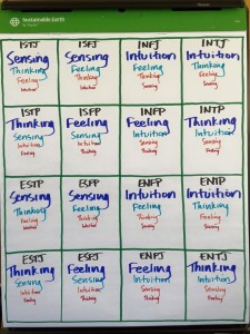
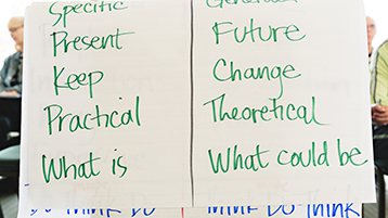
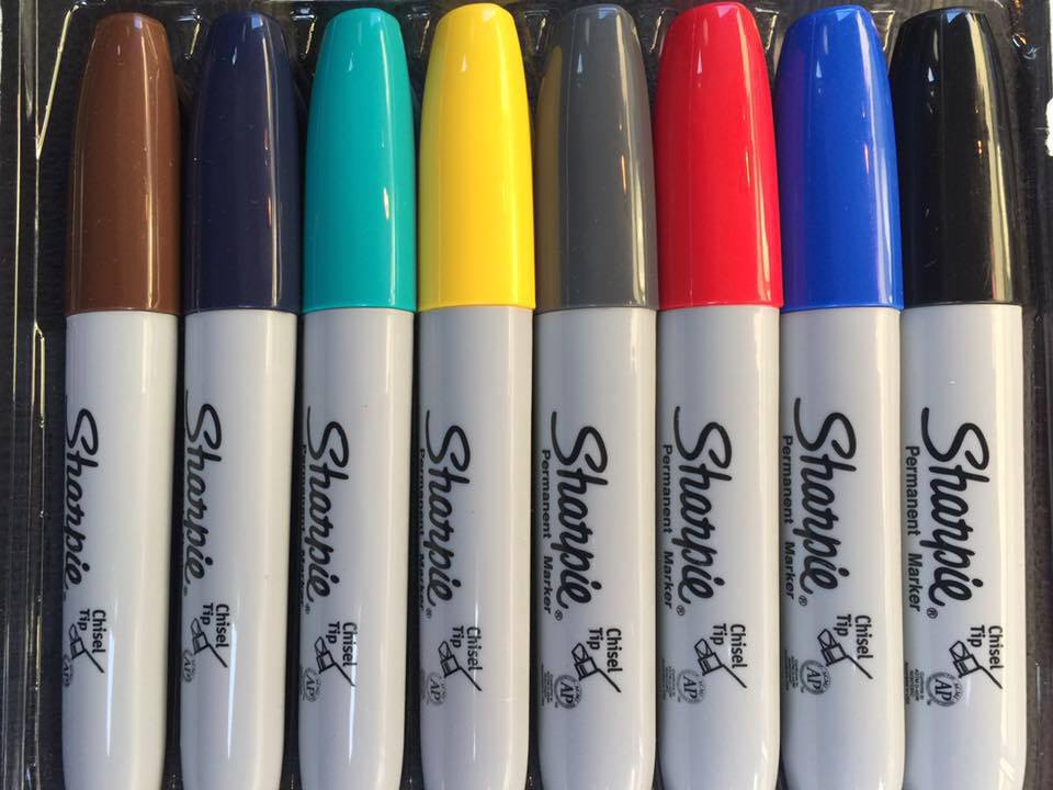
 (Originally Published December 10, 2015) If you’ve attended the College for Congregational Development, or hired one of our consultants for your vestry retreat or mutual ministry review, you might have wondered why we seem so enamored with markers and newsprint. You’ll find them everywhere. We draw our models and survey-feedback exercises on the newsprint; we have you come up and grab a marker to mark where you think your congregation is on the life cycle; we tape sheets of newsprint all over the room and have your group spread out to do a comprehensive parish assessment.
The colors are pretty, you might think. But wouldn’t Powerpoint be tighter, and easier to see? Why not have a cleaner, more electronic presentation?
This isn’t just a style point. It’s an important question, because the  primary aim of the College is to do things that can always be replicated back home, by churches large and small … so how we do things matters. We teach methods to improve the health and sustainability of congregations, and those methods should not be shrouded in mystery, or depend on having state-of-the-art equipment or an organization-development expert in the room. You can learn ways to assess your congregation and plan change right here on this pad of newsprint, make changes and corrections as you go, and then do the same thing with your people at home.
You can create a culture where practically every meeting you run at church is aided by a flipchart and a pack of markers. You can collect and mess with the data or ideas as the group generates them. And you can do it all on a budget. No need for a shiny slide presentation, no need to finance a complex AV display, and no feeling that unless we can afford the Next Big Thing, we can’t make positive change at our place.
And yeah, the colors are pretty! 🙂